The brief
Kamakura is an authentic Japanese matcha tea brand that wants to bring tea culture into modern daily life.
The idea
Less is more, as in the tea ceremony. The name keeps only what matters: KAMAKURA drops two letters and becomes KMKURA.
← All worksBranding · Packaging
Japanese matcha tea
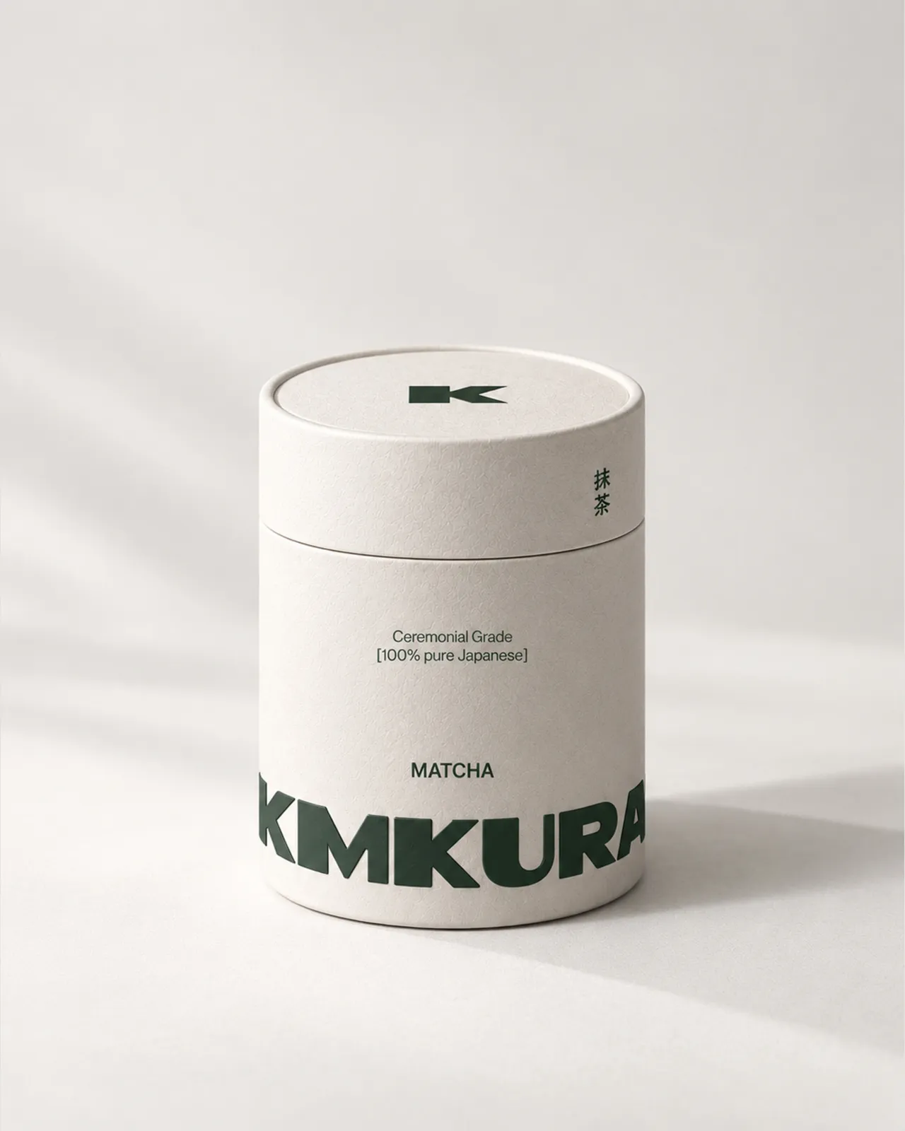
Kamakura is an authentic Japanese matcha tea brand that wants to bring tea culture into modern daily life.
Less is more, as in the tea ceremony. The name keeps only what matters: KAMAKURA drops two letters and becomes KMKURA.







A deep green that conveys energy, elegance and a premium essence, balanced by warm cream and stone tones that speak of purity and calm.
Preparing matcha is an unhurried ritual. The chashaku measures the tea, the chasen whisks it into a fine foam, and every gesture invites you to pause. The brand accompanies that moment with simple, natural pieces: the product becomes an experience, not an object.
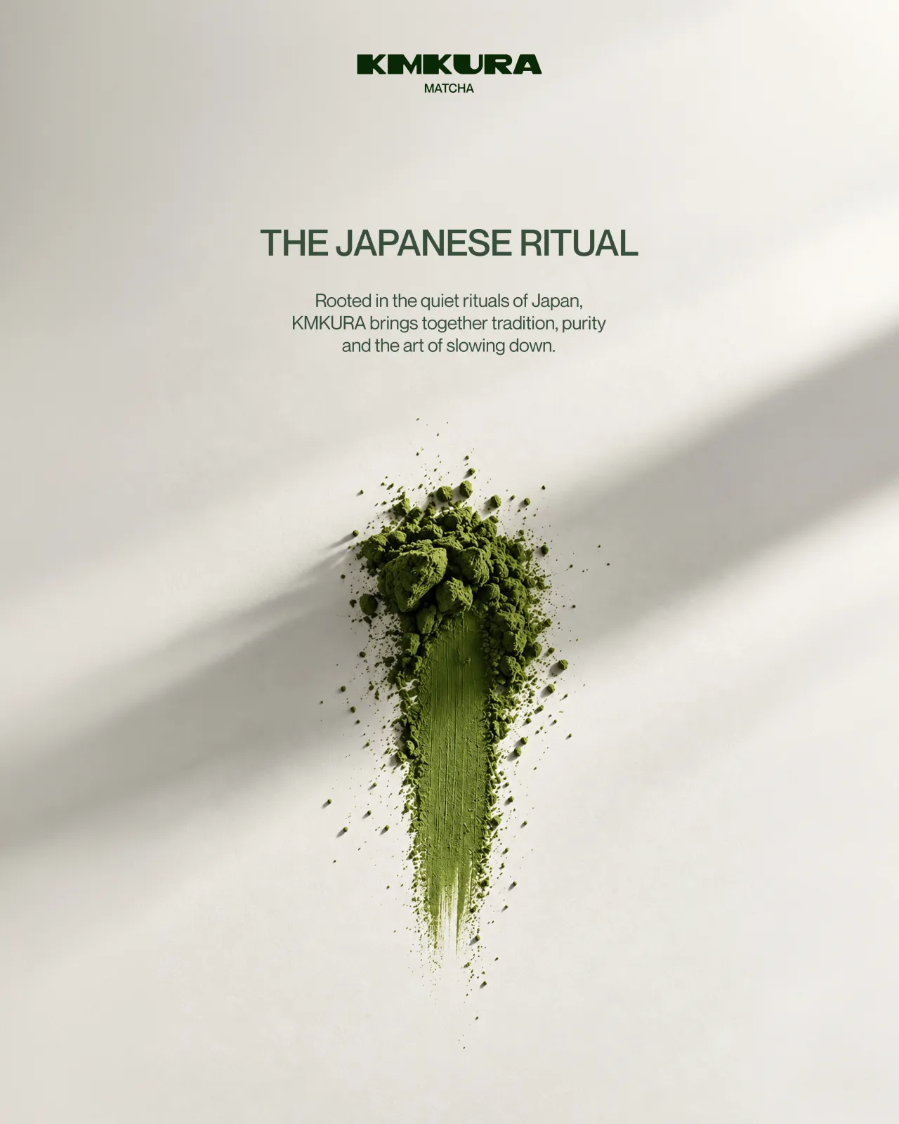
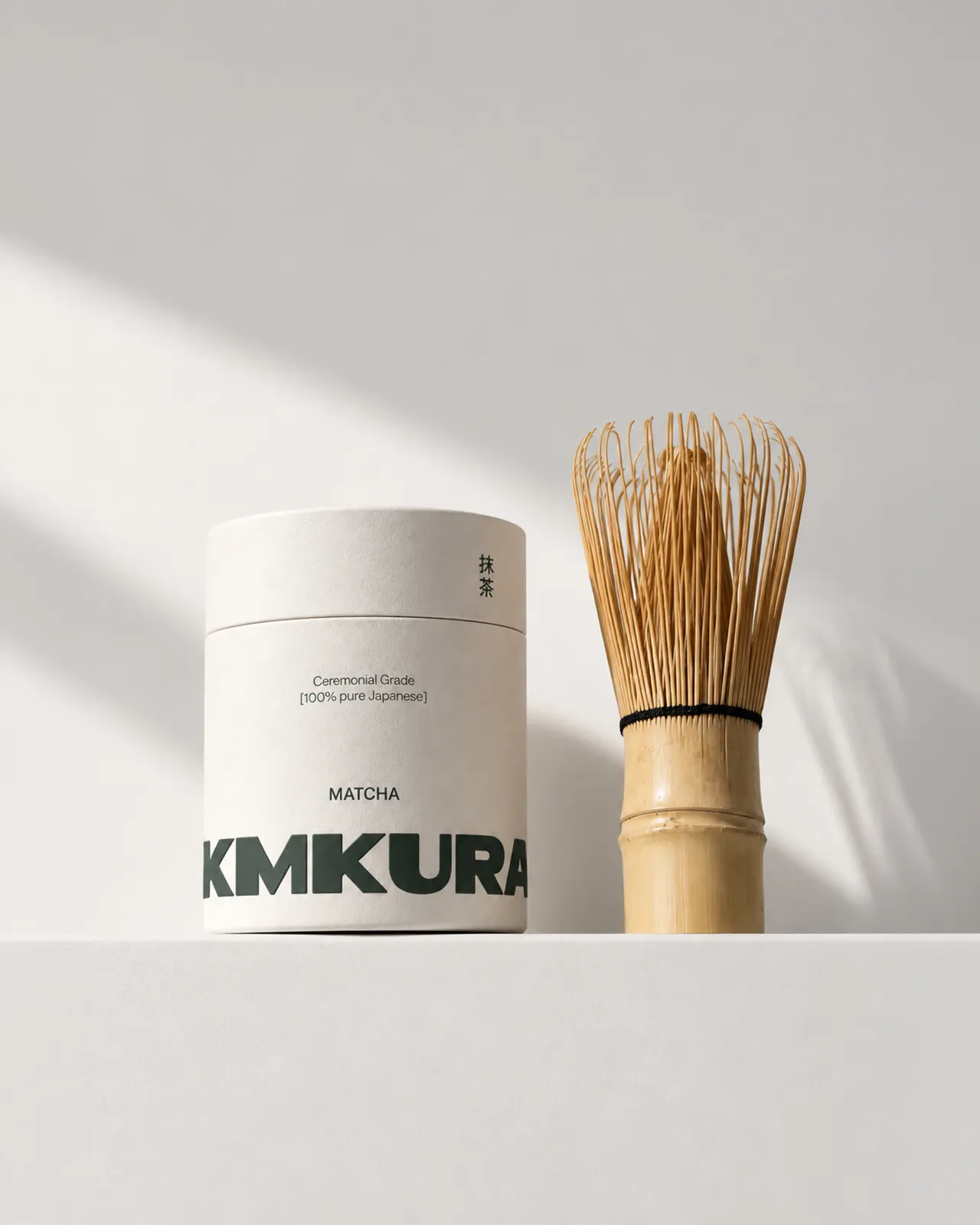
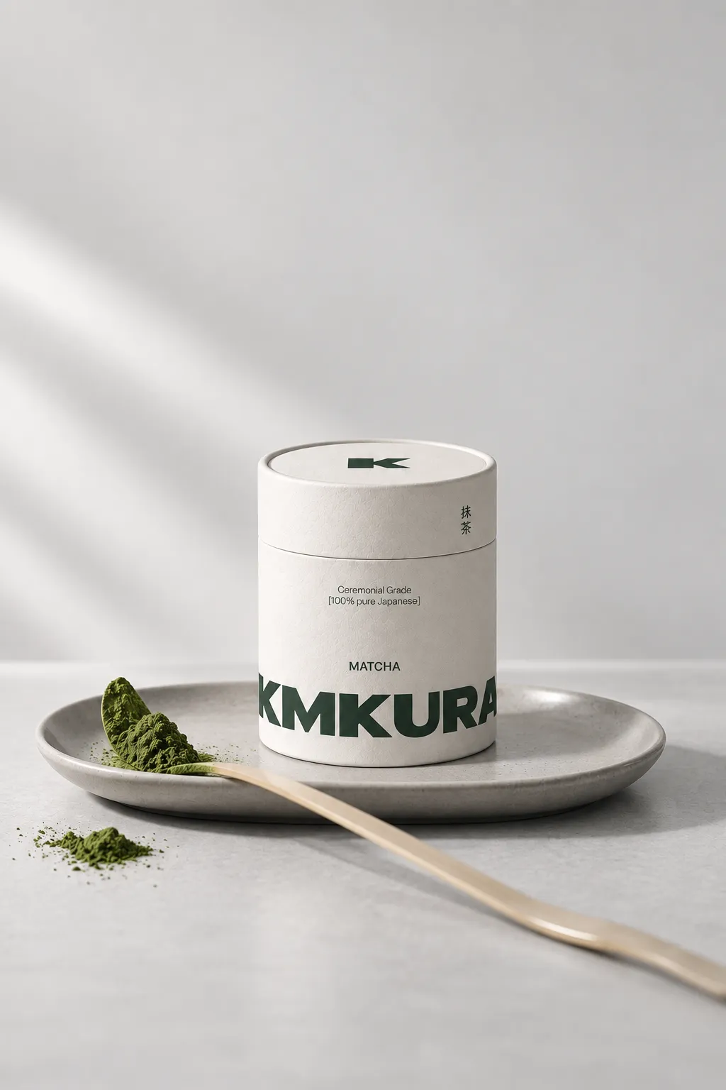
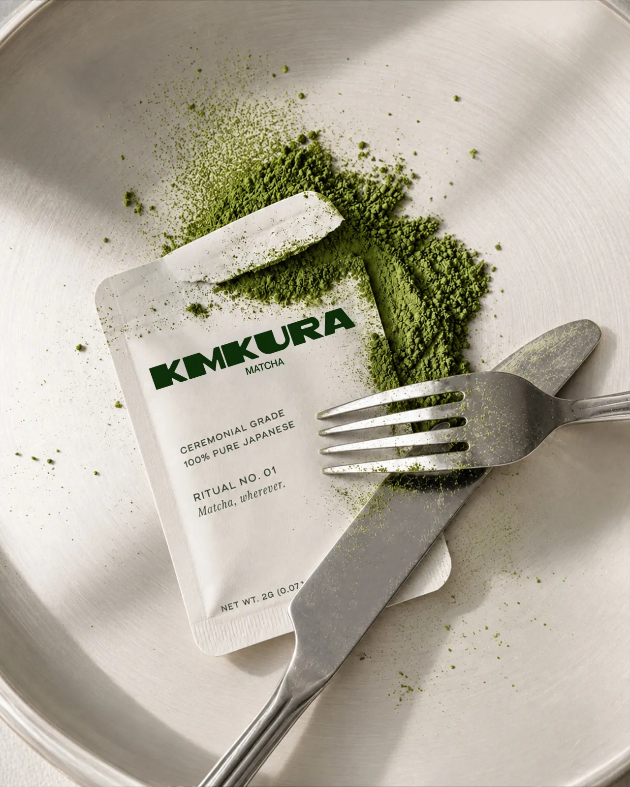
A calm, consistent feed where product, ritual and motion live together in the brand’s colours.
The Japanese ritual, every day.
Ceremonial grade matcha · 100% Japanese
RitualMatchaChasen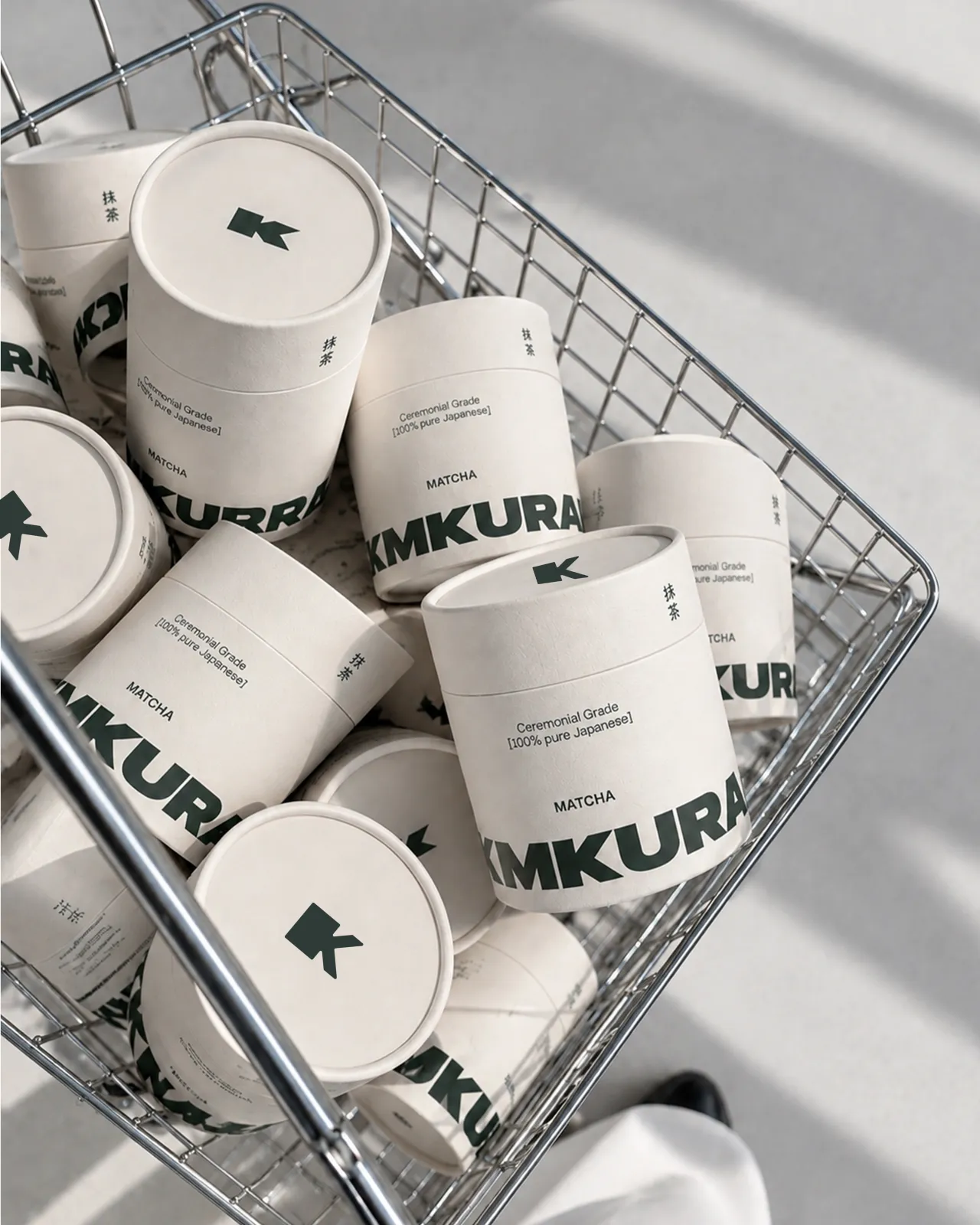 Shop
 MATCHA
A shopping experience cared for down to the last detail. From the shelf to the paper bag, every piece conveys quality and turns the purchase into the first step of the ritual.
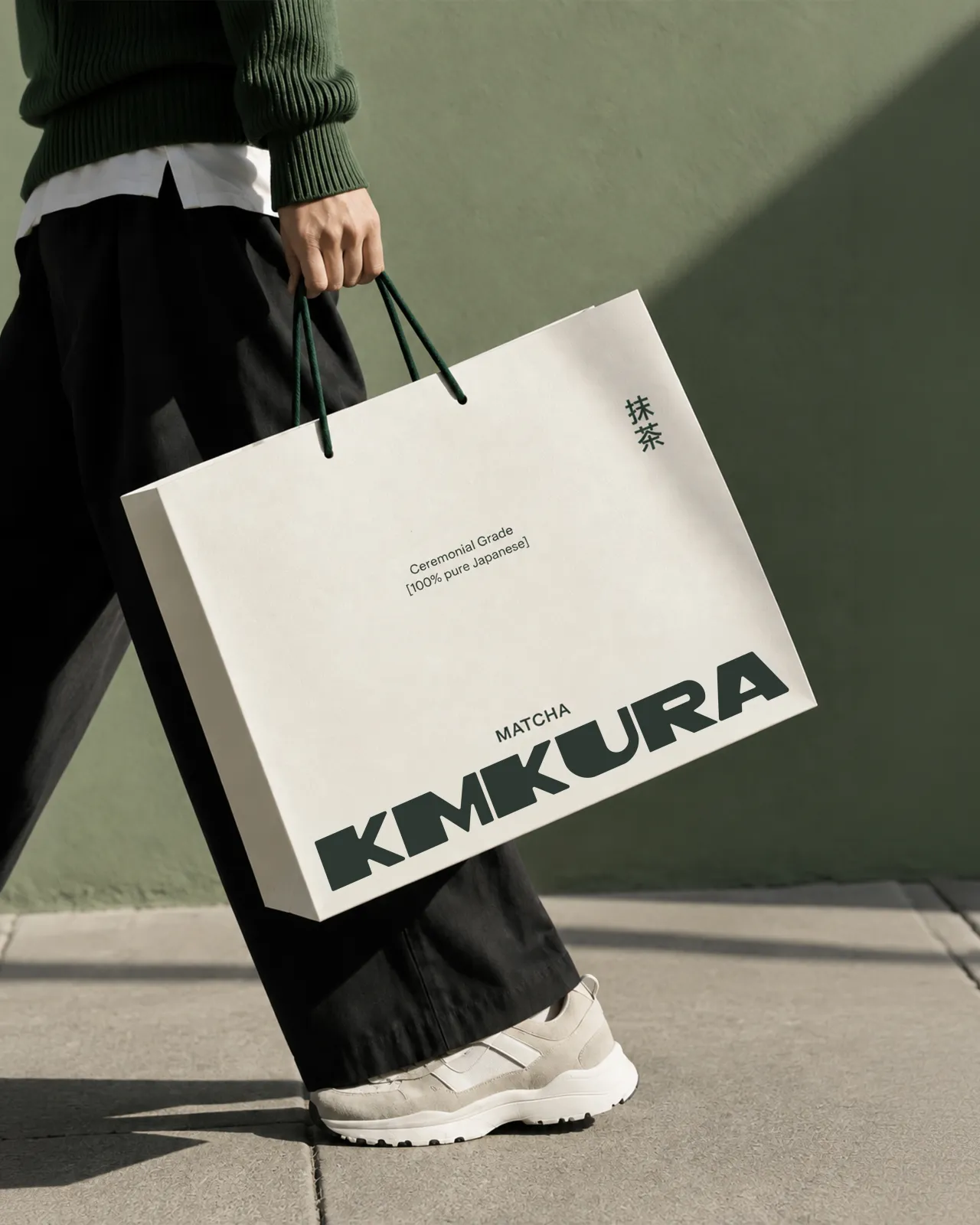
A calm, recognisable identity with a hand-drawn logotype that brings the Japanese tea ritual into everyday life.See it on Instagram ↗︎