← All worksBranding · Packaging · Editorial

NØRDIQ

Scandinavian winter lodges

Brand
Nørdiq Lodges
Year
2025
Services
Identity, packaging, editorial, social
Discipline
Branding, Packaging, Editorial
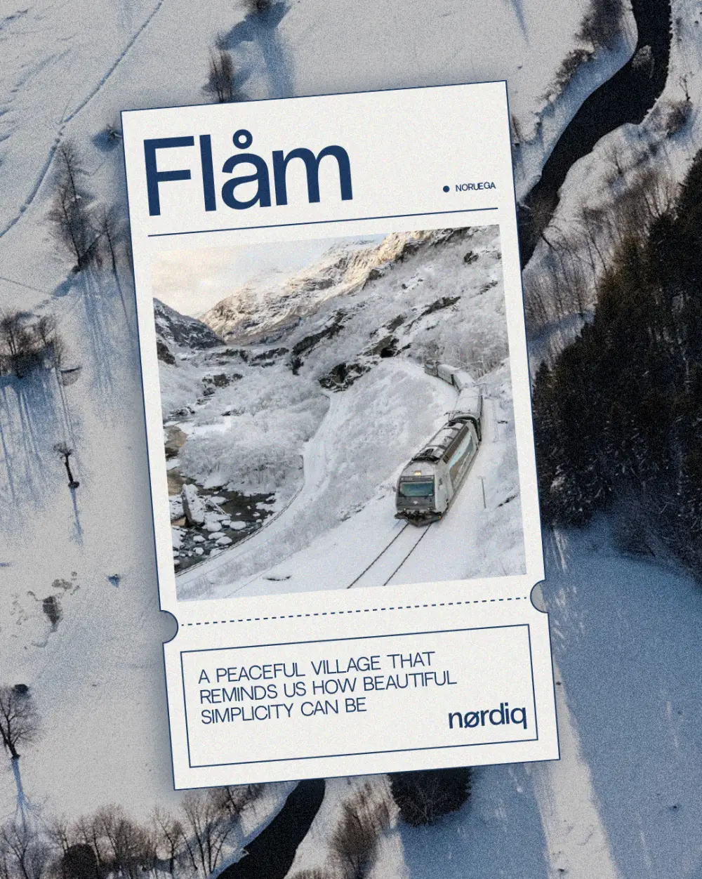
A train between snowy mountains beside a river, with the nørdiq lodges logo and “Where snøw feels like høme”

The brief

Nørdiq is a collection of minimalist wooden cabins in snowy landscapes, designed for winter escapes with Scandinavian-inspired elegance.

The idea

The Nordic Ø as a signature. It replaces the O across the brand (nørdiq, høme, snøw, fjørd) and works on its own as a monogram. Night blue, a snowflake as a seal, and every cabin with its own name.
Where snøw
feels like høme.

The place

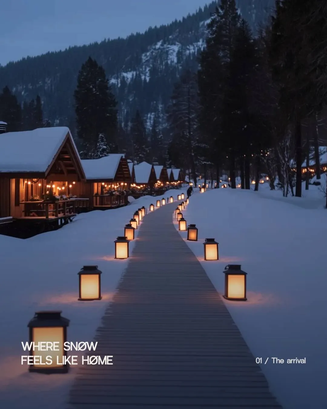
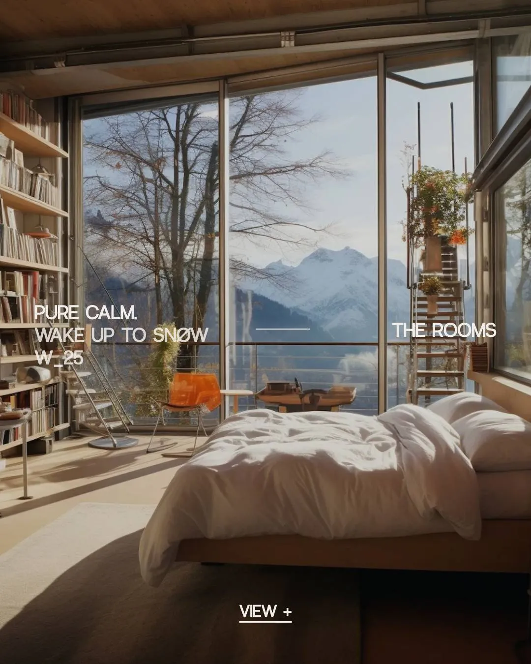
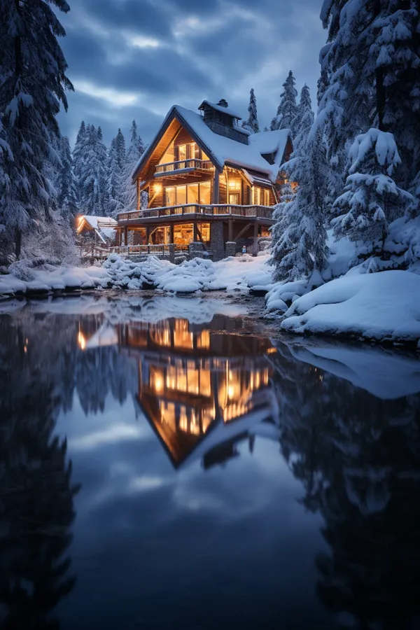
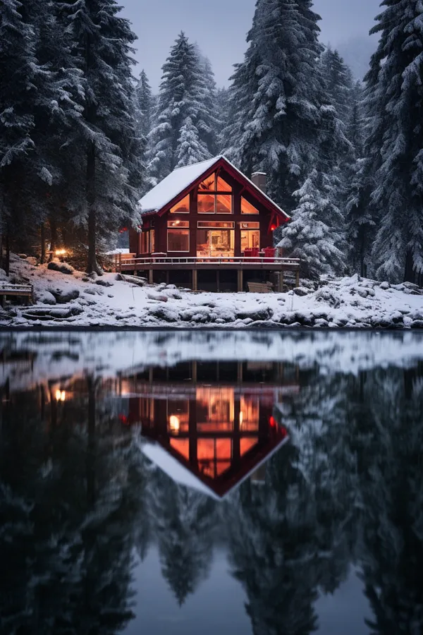
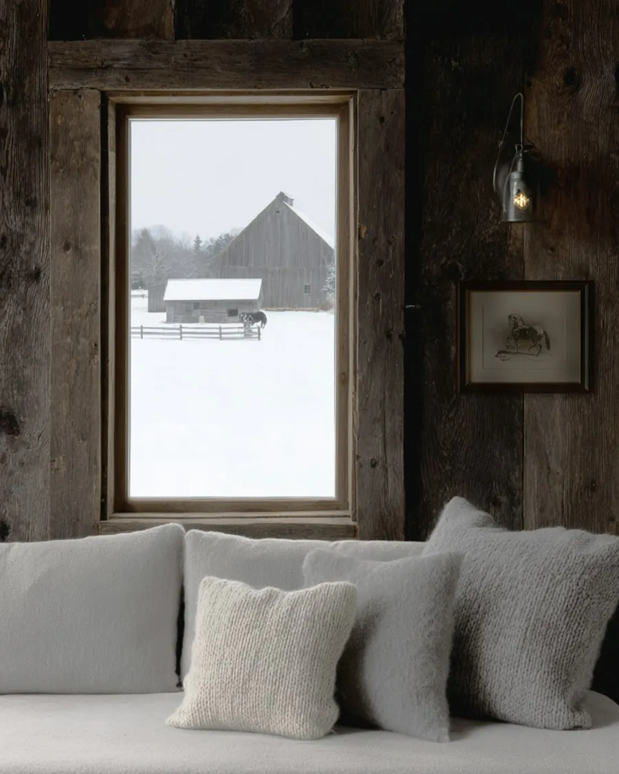
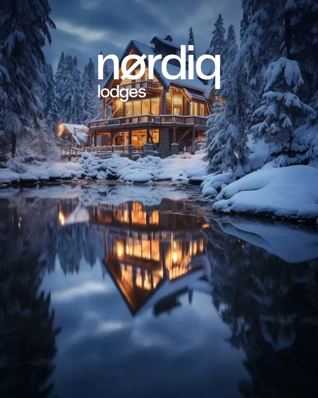
Wooden cabins by the water and warm light in the window. Inside, wood, linen and large windows to watch the snow from bed.

Swipe or use the arrows to browse the carousel.

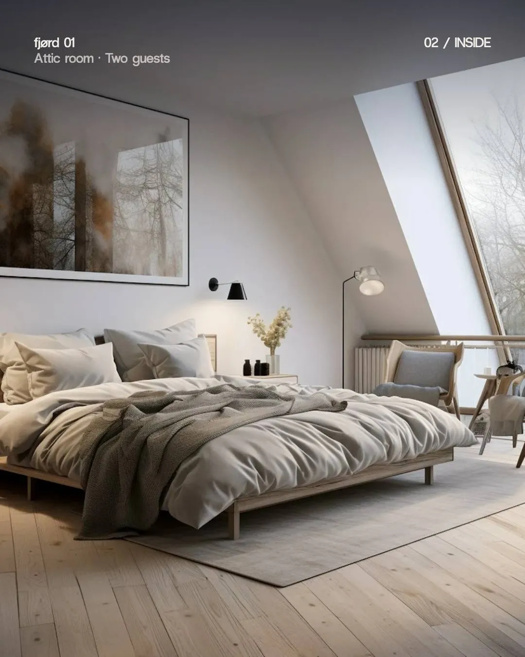
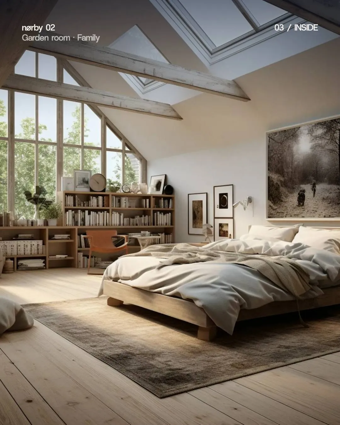
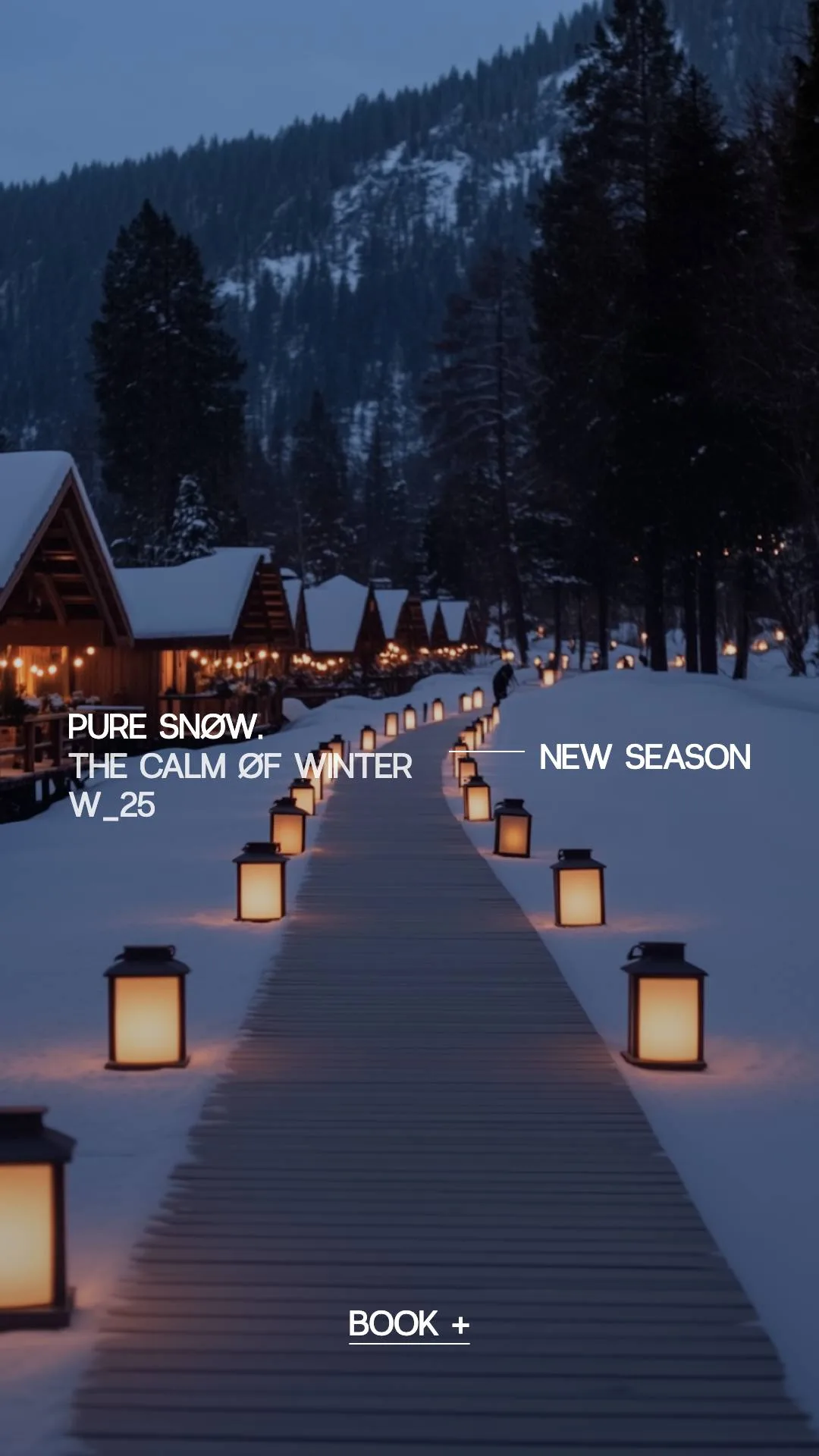
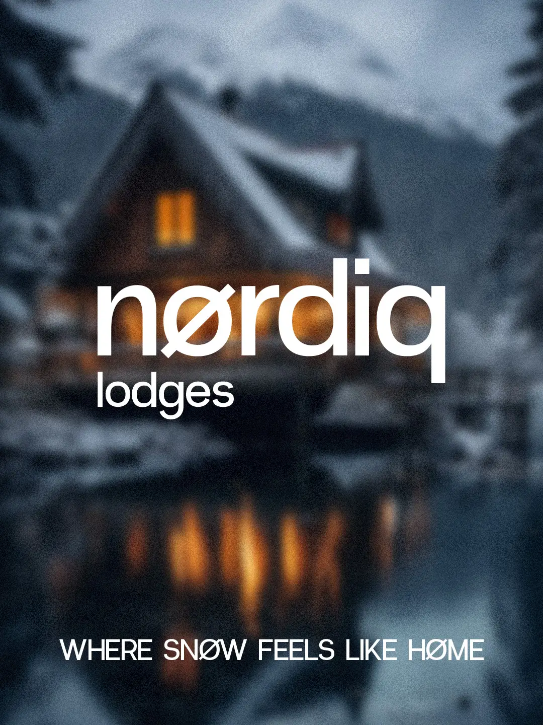
Carousel cover: “Lodge showcase, Part I”, over a blurred cabin A lit cabin by the lake with the nørdiq lodges logo A lantern path in the snow: “Where snøw feels like høme” Bedroom with a large window: “Pure calm. Wake up to snøw” Attic bedroom in the fjørd 01 cabin Bright bedroom in the nørby 02 cabin Night-blue closing slide: “The lodges. We’ve slowed down. So should you.”
Instagram carousel · stock mood photography

The brand

A clean logotype with the Ø at its heart and, for small spaces, the Ø on its own.

The nørdiq lodges logotype in white on night blue The Ø monogram with the word lodges, in white on night blue
Logotype and monogram

A colour landscape

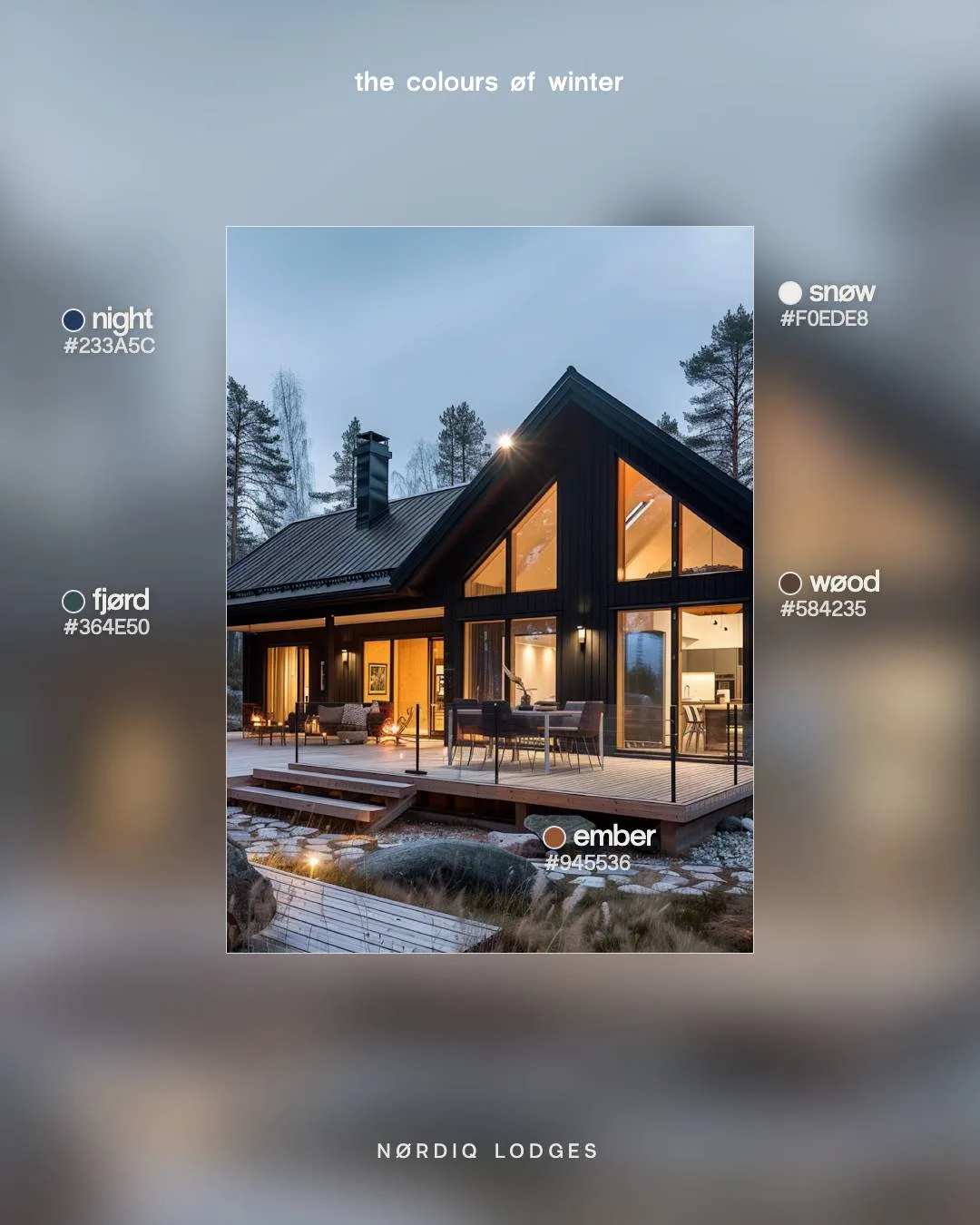
Five colours taken from the Nordic landscape: night, snow, fjord, wood and the embers of the fireplace.

Palette

Editorial

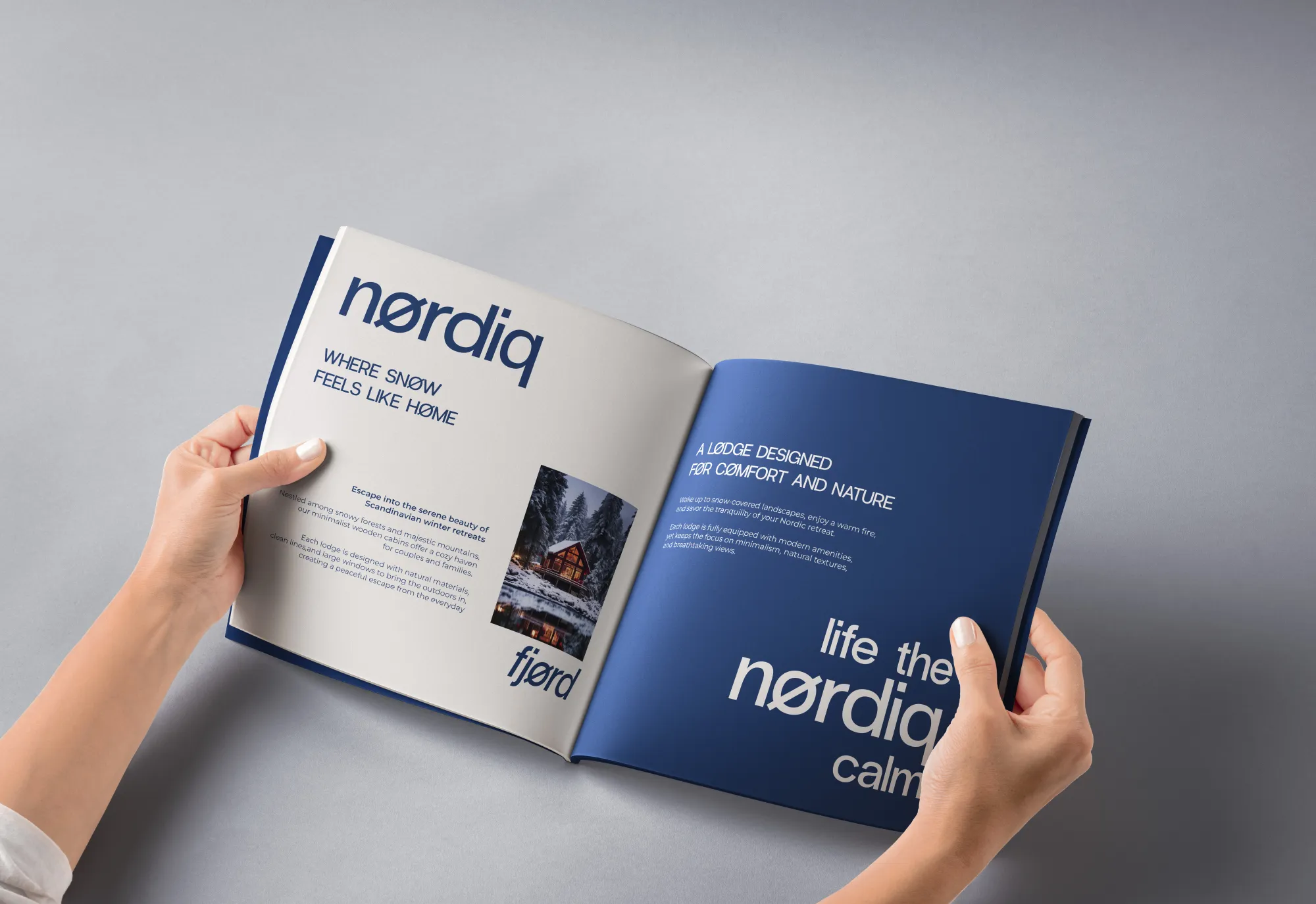
A catalogue for choosing your cabin, with plenty of air and landscape photography.

Two hands holding the open Nørdiq Lodges catalogue, with cream and night-blue pages
The catalogue

Boxes and keys

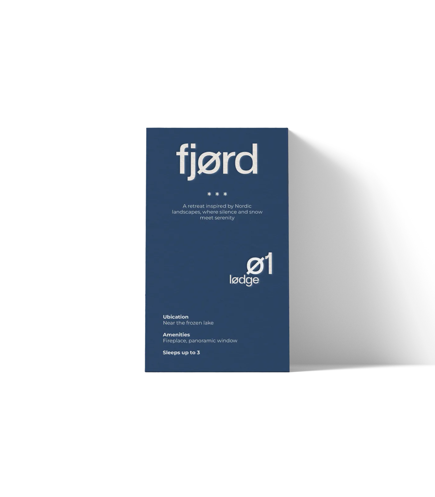
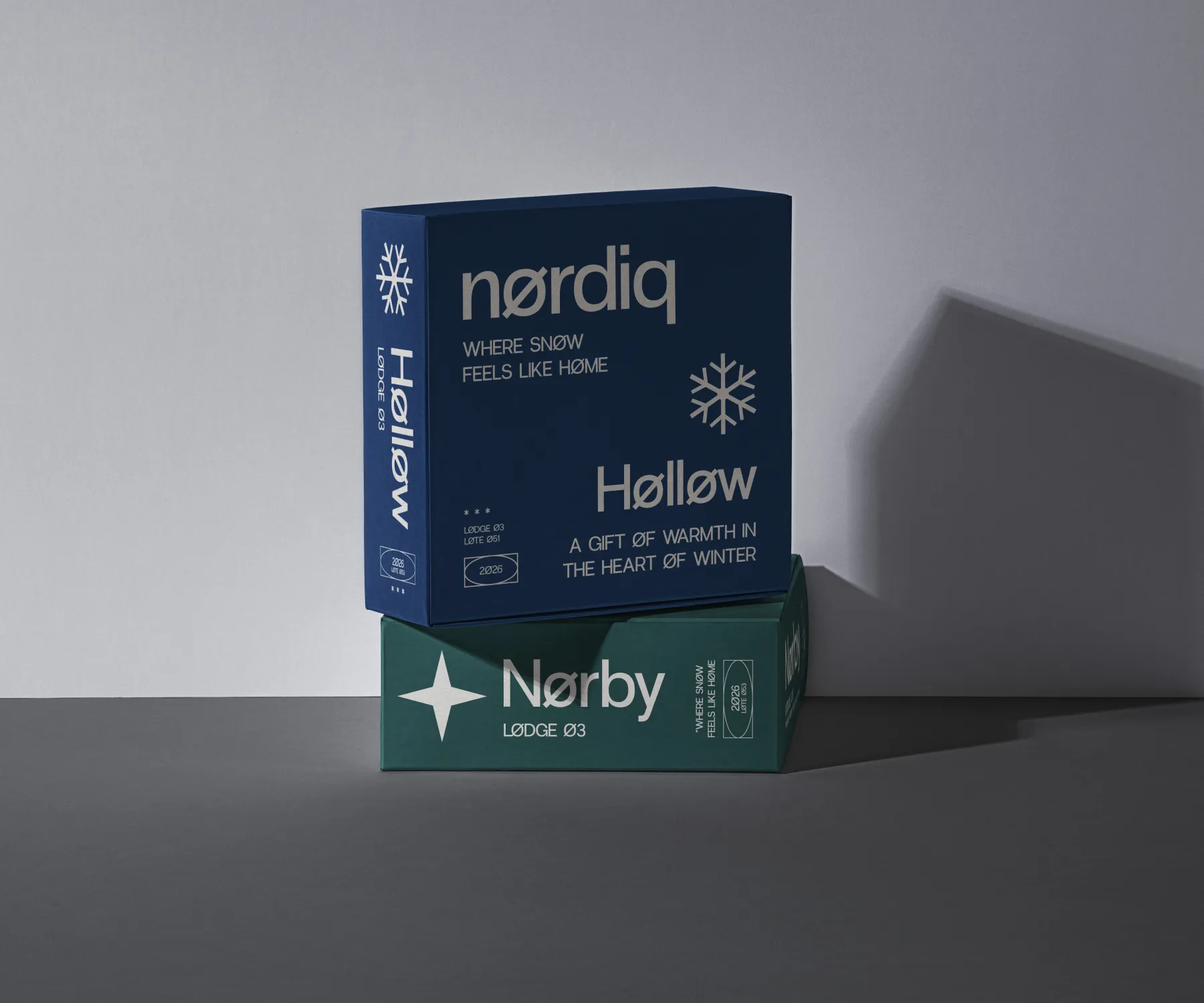
Every cabin has its own name, welcome box and numbered key card: Høllow, Nørby, fjørd 01… sealed with the snowflake.

A fjørd 01 card standing up, in night blue
fjørd 01
Welcome boxes for the Høllow cabin, in blue, and Nørby, in green
Høllow and Nørby
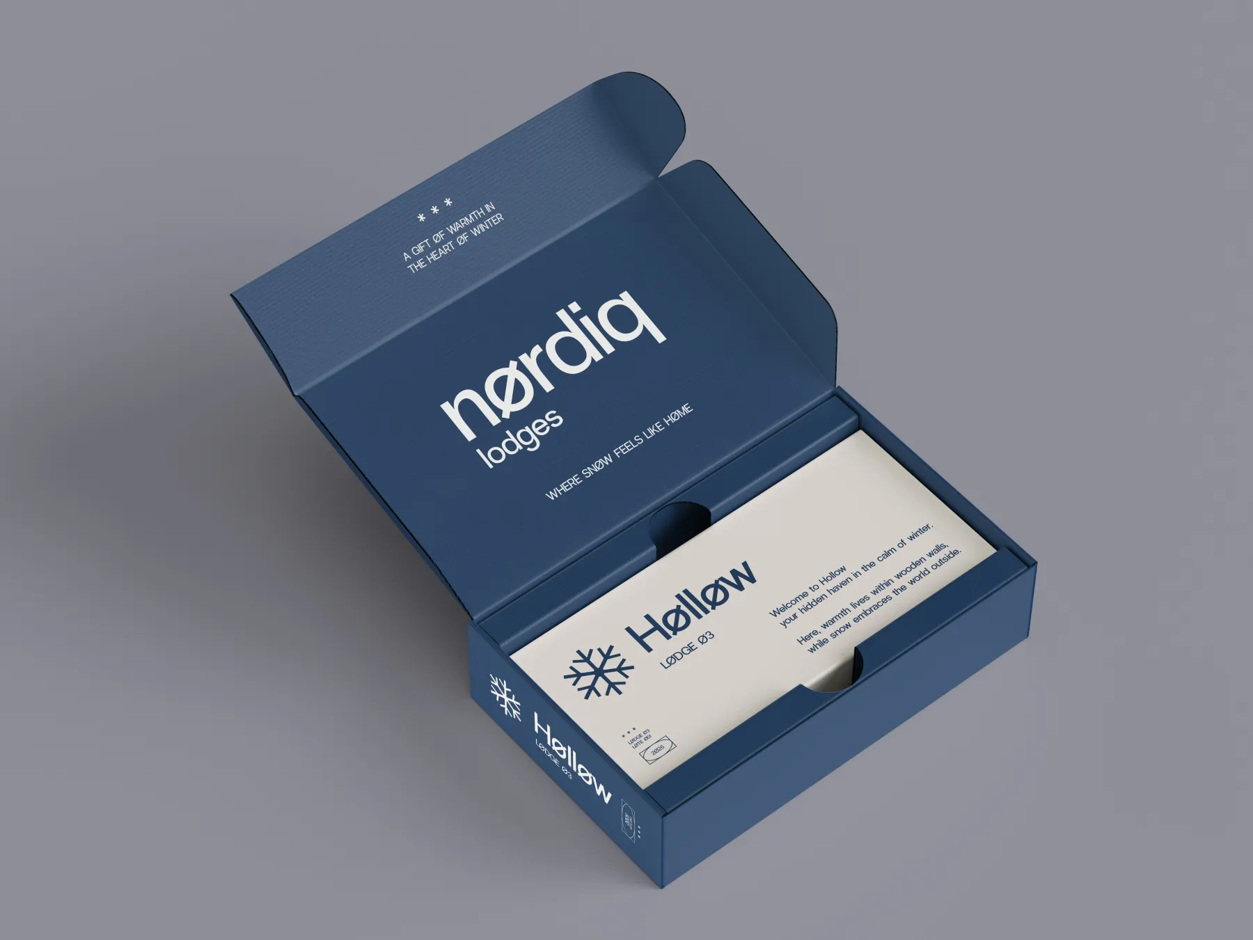
An open blue Nørdiq box with a card inside
The box, open

On social

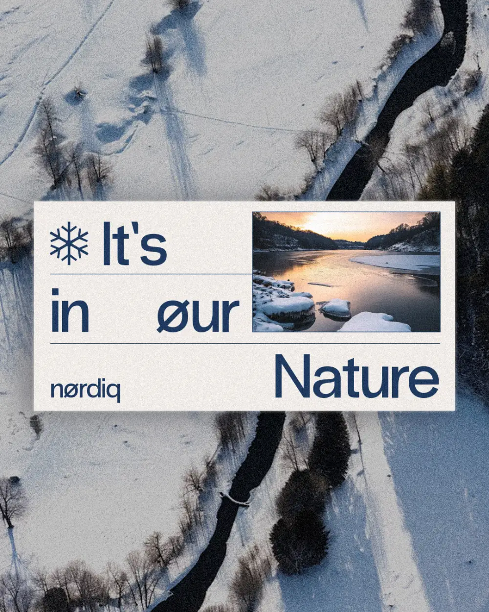
Instagram content in the brand’s voice: the palette, the cabins and the season, always with the Ø.

Posts and stories

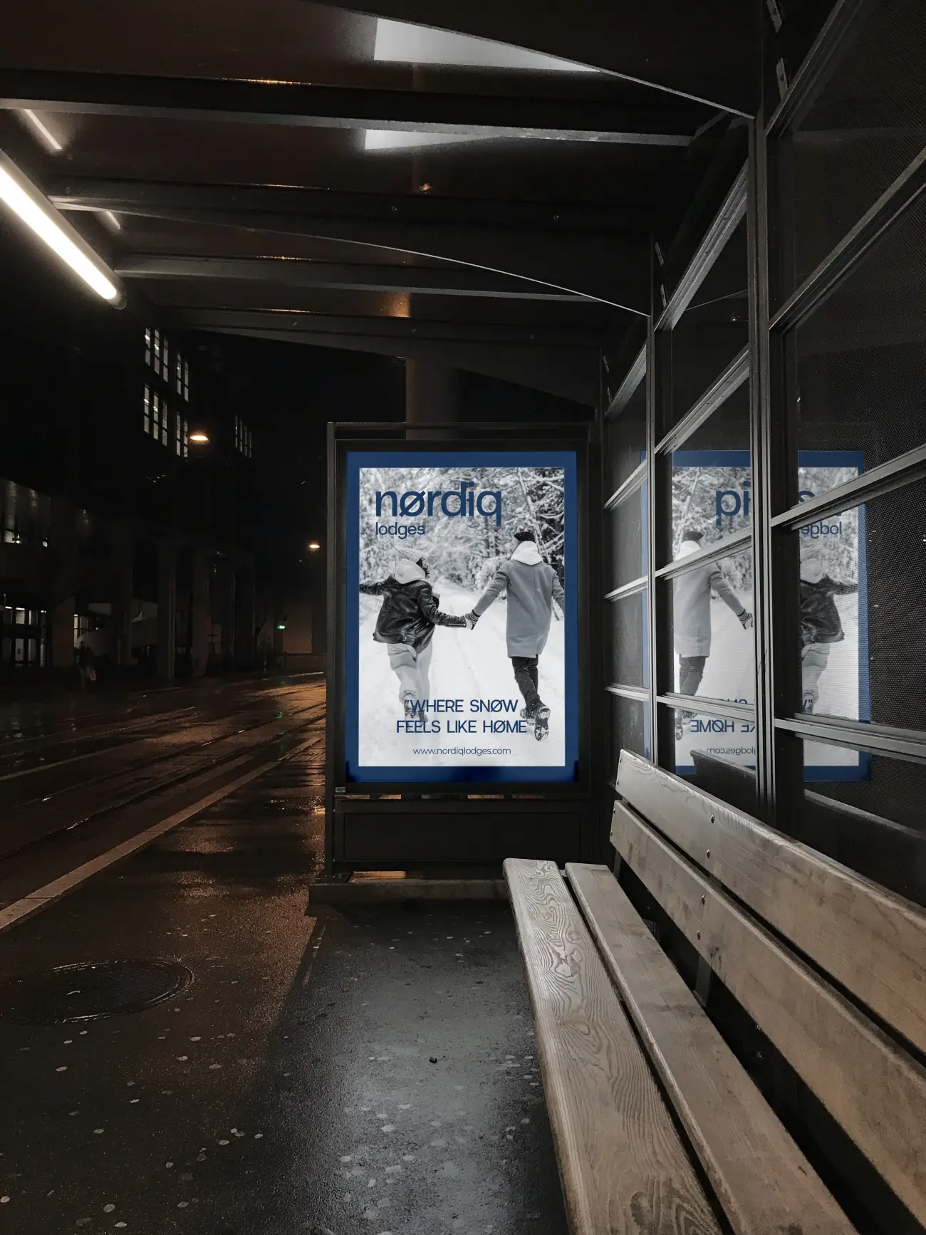
On the street

From the bus shelter to the city: the same calm, the same blue.

The result

A warm, calm system that runs from the logotype to the catalogue, the welcome boxes, the cabin cards, the street and social media. Where snow feels like home.

Get in touch